SERCEA PROJECT - Clinical Trial System
Technical Observations
| Prepared By | Francis M. Njambi |
| Designation | ICT Officer , KEMRI |
| Date | 1st Sept. 2025 |
Subject System
URL: Gateway - SERCEA
Login Page
Overview: The page is well structured with two columns with two dominant colors making it neat and simple for the user.
Proposed Areas for Improvement
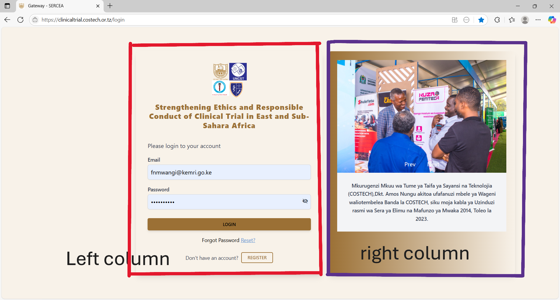
First Column (Left Section) :
-
- Stakeholders Logos: Should have title (text appearing on hovering upon the logo - full name or the organization) and alt text (text that appears incase the image fails to load, typically a meaningful name like the organizations name). This is for accessibility.
- Forms:
- Login Form
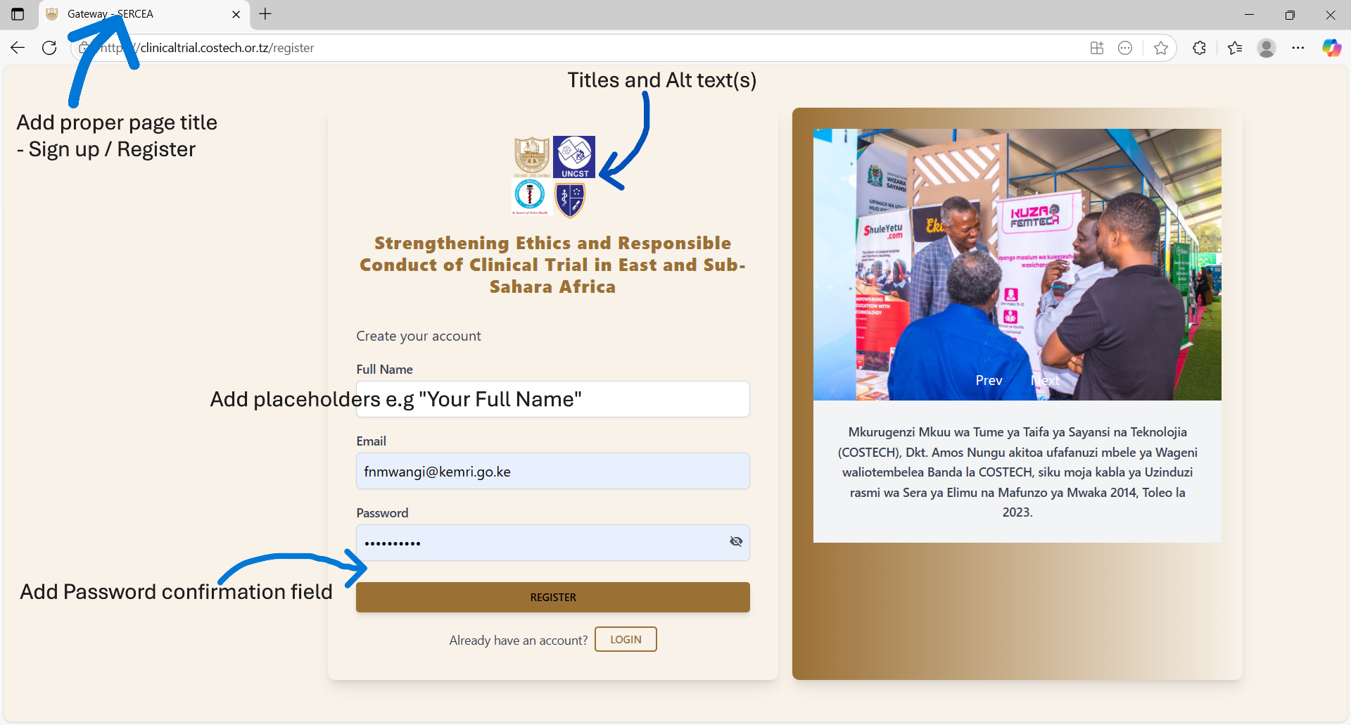
- UX: add autocomplete property on both the form and fields. This is to ensure no auto population of credentials and speaks to security and privacy controls.
- UX: Use of hints / Placeholders : Despite the labels use placeholders to easily direct the user what data to input.
- Register User / User Onboarding:
- same UX controls as login form
- UX: Add a password confirmation field.
- Non-Functional: Ensure users activate their accounts first before accessing the system. This can be done via a link sent to the onboarding e-mail accounts, upon clicking the link , the system can validate ownership of their e-mail account and activate their accounts. This filters a lot of spam accounts.
- Proper validation / error messages should be displayed accordingly.
- Login Form
Second Column (Right Section)
Pictorial: You have Prev and Next buttons, this means you should have a carousel / image slider. Therefore add more images and activate those navigation buttons.
Header Component
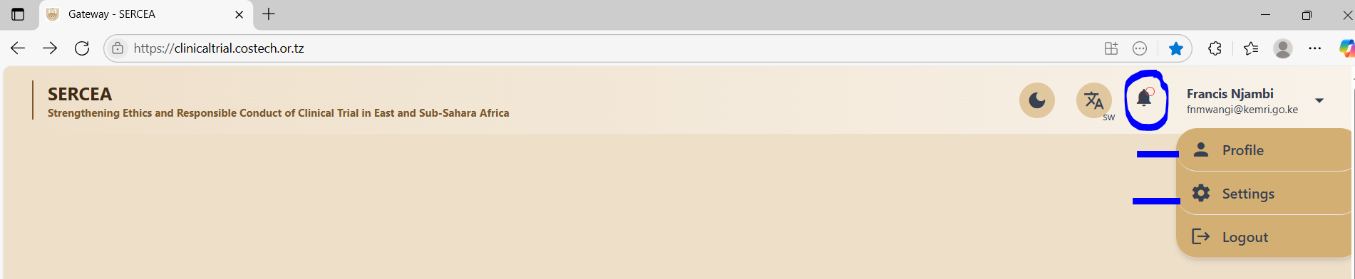
Existence of Inactive Links
The system has several inactive links on the clinical trials page that a user lands after successful login, they include:
- Notification Icon (Bell icon on the header - top right navigation bar)
- Profile link from the user dropdown - top right on the navigation bar
- Settings link from the user dropdown top left on the navigation bar
Recommendations / Suggestions
Profile Link: should have a page that allows a researcher to input their bio sketch - rich text format.
Settings Link: Should have a page with facilities to include setup of data options like randomization methods.
Footer Component
This was non-existent at the time of this evaluation: A footer section shows completeness of a web page and is useful in scenarios where:
- You need to show the application time lines : when the app went into production up until current time.
- You wish to display copyright data.
- You need to show compliance information like:
- Terms of use.
- Privacy notices
- Any other critical non-system function information.
Clinical Trials : List / Index Page
Overview: Well done.
Concern: How can a user view other researchers trials - Assuming a scientist has given consent for general access to their work?
If that is the case then there should be a toggle / Switch for : own clinical trials entries and that of other scientist's clinical trials - filtered by consent for access.
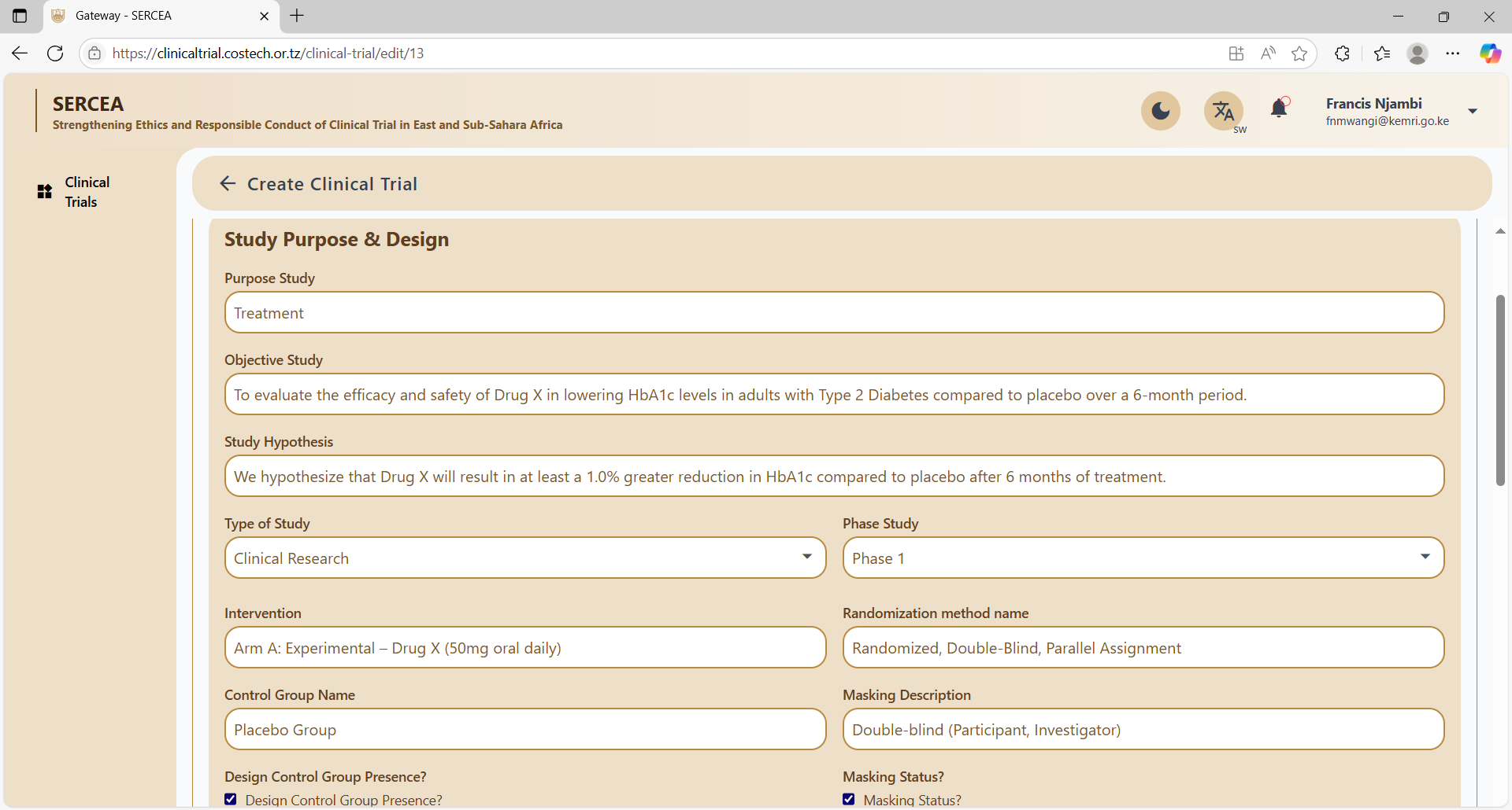
Create Clinical Trial Page
Overview: Long form, properly structured in accordions / collapsible cards.
Section 1; Clinical Trial
Concern :
Could not add data on the first section / accordion until I navigated to the list and back to the clinical trials form.
UX: No meaningful validation error messages are given
Security:
- Access token and user name are visible on the browser developer console. This is a significant security flaw.
- The access token seems to expire and refresh without login out the user. Very unsecure API design.
Verdict: This renders the system very difficult to use.
Error given: Unable to validate request data.
See video here.
Section 2: Study Purpose and Design
UX: Multiple sentence text inputs such as :
- Study objective
- Study Objective
should be preferably be input via text area and where possible WYSIWYG rich text editors.
Study Population
Concerns:
- Lack of meaningful validation errors
- Are there optional fields? e.g what if a researcher does not have a Final participant number yet.
- Rich text editors for descriptive text
Study Timeline & Location
Concerns:
- Typo: Form Legend - Study Timeline "&" Location.
- UX: Long drop downs e.g country list should be searchable.
- Regions: should correlate to country e.g Cities or states of a country to avoid unclean data, therefore consider dependant dropdowns such that the regions are relevant to the chosen country.
- Date validation: where you have timelines , a start date and duration , should validate the end date, or both dates should validate the duration, you cannot have the user enter all those 3 variables ,this again is for data hygiene.
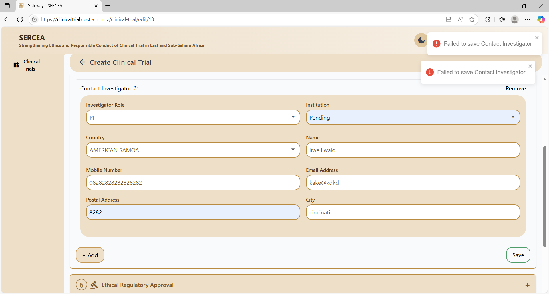
Contact Investigator
Concerns:
- UX: Long drop downs e.g country list should be searchable.
- Validation: Country - City dependency.
- UX: Meaning full field level validations not a general error: "Failed to add contact investigator"
- Button visibility as per proper state, e.g save should appear when the form seems valid.
- failed to save the form.
- UX: Make use of inline editing and input on a table rather than a form for such related multiple entity data. It's more neater and effortless for the user.
Ethical Regulatory Approval
Concerns:
- The concerned Ethical Review Board should get a notification and a link to this record. this could be for awareness or validation or courtesy.
- Validation : Save button continues to save when pressed subsequent times even without an attachment.
Funding Sponsorship
Concerns:
- Validation : Save button continues to save when pressed subsequent times.
- UX: Make Long dropdowns searchable.
Study Description
Concerns:
- Validation : Save button continues to save when pressed subsequent times.
Study Interventions and Outcome
Concerns:
- Validation : Save button continues to save when pressed subsequent times.
Study Result Publication
Concerns:
- Functional: Publisher dropdown data should be updatable by researchers preferably on the settings pages.
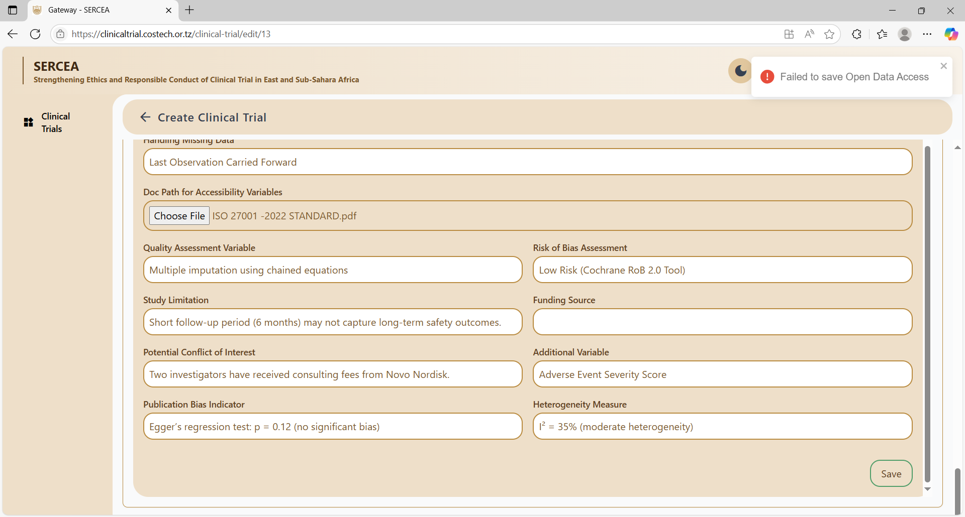
Open Data Access
Concerns:
- What is the significance of allow publish?
- Descriptive input should make use of text area with rich text capabilities, e.g Sensitivity Analysis Result, Study Limitations
- Field Misplacement: Is funding source not misplaced ?
- No meaning error messages on validation failures.
Failed to save: No Error Messages
View (Read Only )Page
Concerns:
- Links should be clickable and preferably open on a new page e.g DOI links
- File Attachments should not force a download by default, rather they should open in an embedded manner and let the user decide whether to download on the machine or not.
Conclusion
There is work that has been done but there is also a massive room for improvement in the following notable areas:
- Security: Access control has been poorly configured, there is too much platform specific (public IP, web server, OS, user access token e.t.c) data explosed, this poses immense privacy and data security concerns.
- User Experience (UX) - Users will need meaning full , specific error messages in case of errors, descriptive data need to be accommodated in a rich text format for usability.
- Utility: After filling in the data:
- what kind of processing or value addition take place after all that work.
- why should a scientist use the platform?
- Timeouts are not handled properly: If the API token expires, degrade access gracefully or regenerate seamlessly.
- Data Validation in the mentioned areas from user onboarding , durations to correlated data needs to be well handled if analysis would be required some day.