SERCEA PROJECT - Clinical Trial System
Technical Observations
Subject System
URL: Gateway - SERCEA
Login Page
Overview: The page is well structure with 2 columns with 2 dominant colors making it neat and simple for the user.
Proposed Areas for Improvement
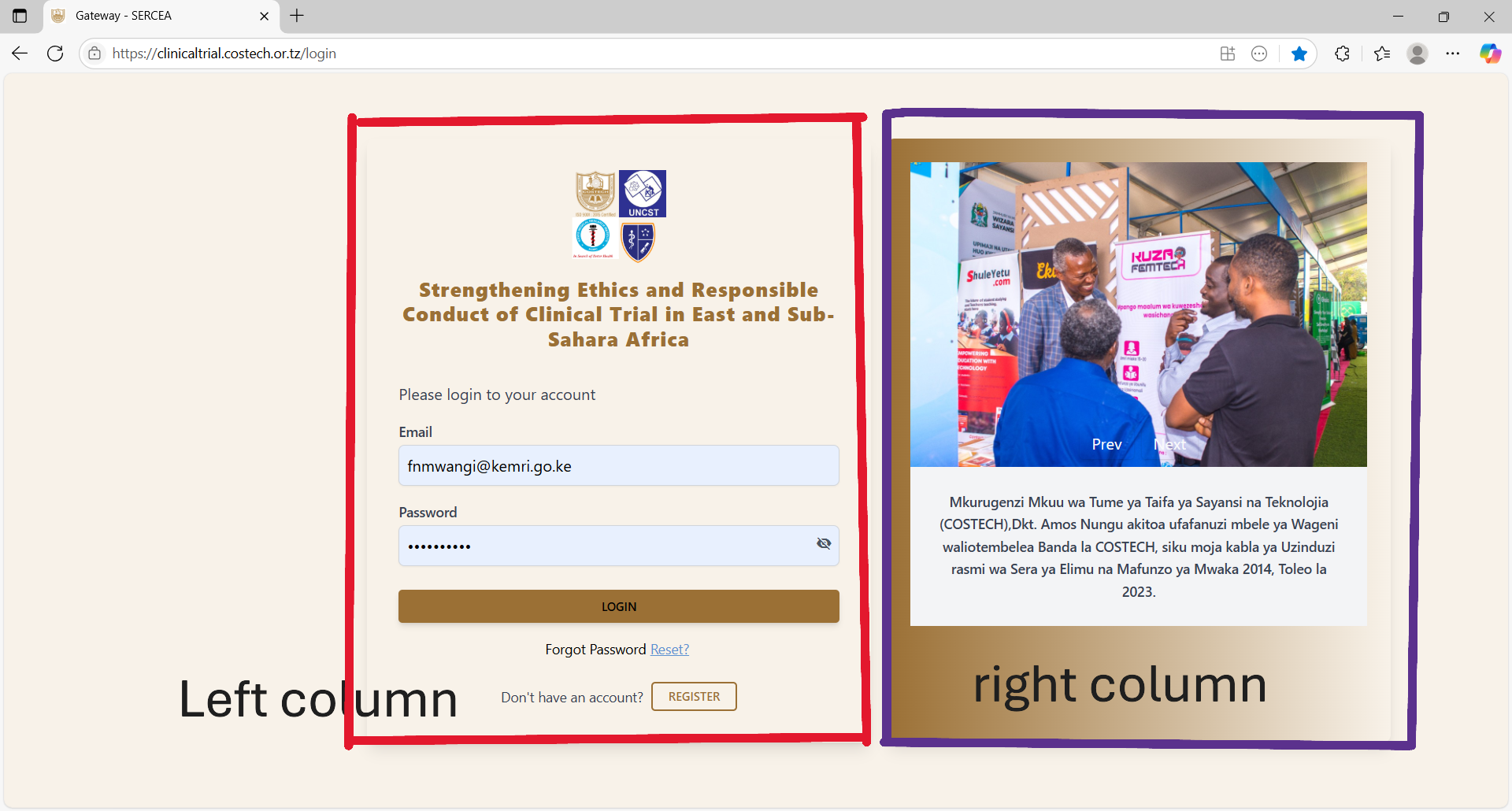
First Column (Left Section) :
-
- Stakeholders Logos: Should have title (text appearing on hovering upon the logo - full name or the organization) and alt text (text that appears incase the image fails to load, typically a meaningful name like the organizations name). This is for accessibility.
- Forms:
- Login Form
- UX: add autocomplete property on both the form and fields. This is to ensure no auto population of credentials and speaks to security and privacy controls.
- UX: Use of hints / Placeholders : Despite the labels use placeholders to easily direct the user what data to input.
- Register User / User Onboarding:
- same UX controls as login form
- UX: Add a password confirmation field.
- Non-Functional: Ensure users activate their accounts first before accessing the system. This can be done via a link sent to the onboarding e-mail accounts, upon clicking the link , the system can validate ownership of their e-mail account and activate their accounts. This filters a lot of spam accounts.
- Proper validation / error messages should be displayed accordingly.
- Login Form
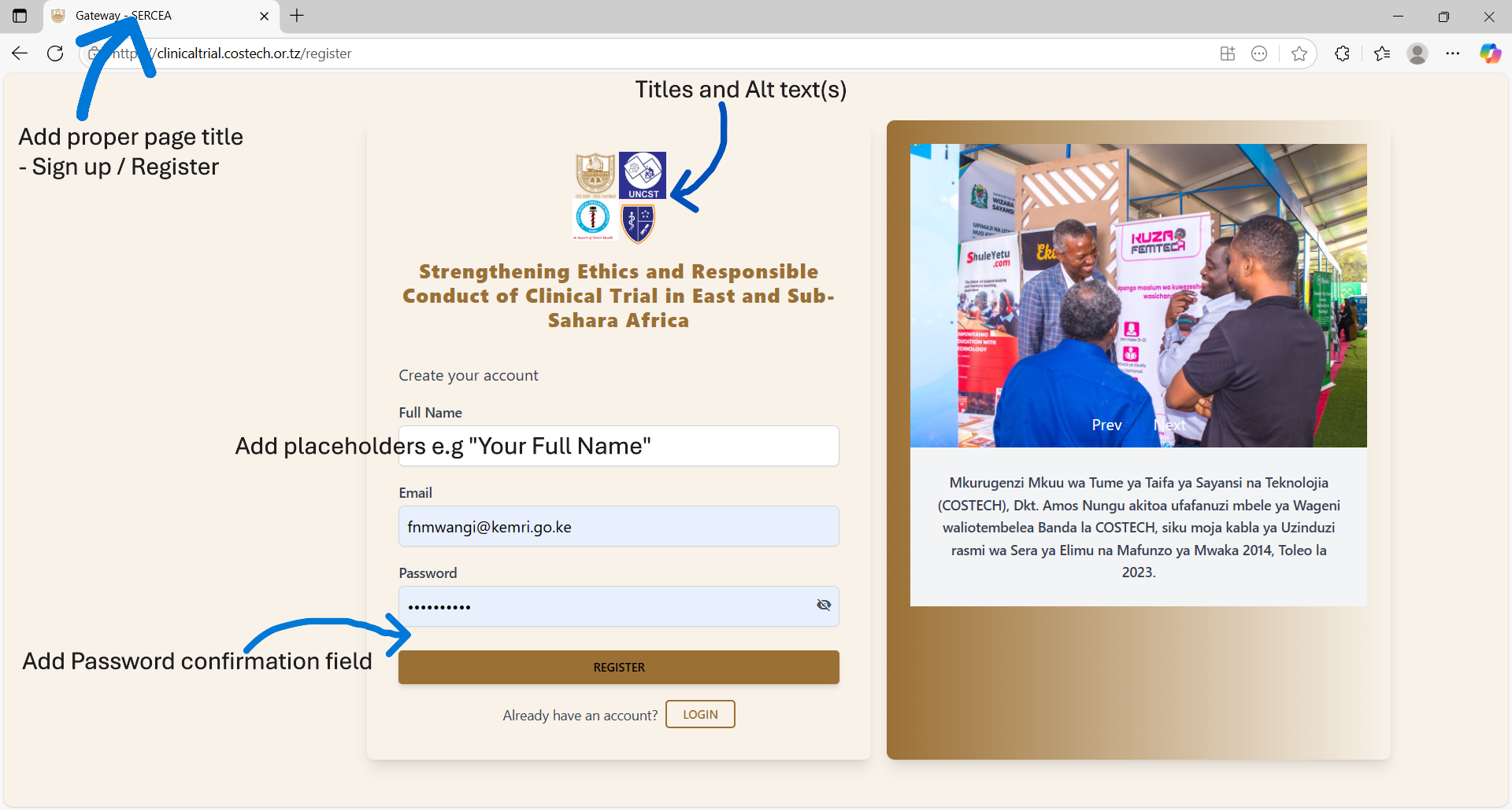
Second Column (Right Section)
Pictorial: You have Prev and Next buttons, this means you should have a carousel / image slider. Therefore add more images and activate those navigation buttons.
Header Component
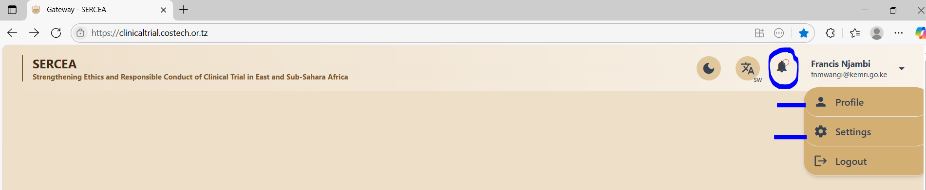
Existence of Inactive Links
The system has several inactive links on the clinical trials page that a user lands after successful login, they include:
- Notification Icon (Bell icon on the header - top right navigation bar)
- Profile link from the user dropdown - top right on the navigation bar
- Settings link from the user dropdown top left on the navigation bar
Recommendations / Suggestions
Profile Link: should have a page that allows a researcher to input their bio sketch - rich text format.
Settings Link: Should have a page with facilities to include setup of data options like randomization methods.
Footer Component
This was non-existent at the time of this evaluation: A footer section shows completeness of a web page and is useful in scenarios where:
- You need to show the application time lines : when the app went into production up until current time.
- You wish to display copyright data.
- You need to show compliance information like:
- Terms of use.
- Privacy notices
- Any other critical non-system function information.
Clinical Trials : List / Index Page
Overview: Well done.
Concern: How can a user view other researchers trials - Assuming a scientist has given consent for general access to their work?
If that is the case then there should be a toggle / Switch for : own clinical trials entries and that of other scientist's clinical trials - filtered by consent for access.
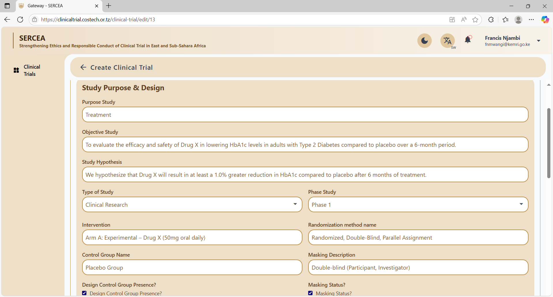
Create Clinical Trial Page
Overview: Long form, properly structured in accordions / collapsible cards.
Section 1; Clinical Trial
Concern : Could not add data on the first section / accordion until I navigated to the list and back to the clinical trials form.
UX: No meaningful validation error messages are given
Security:
- Access token and user name are visible on the browser developer console. This is a significant security flaw.
- The access token seems to expire and refresh without login out the user. Very unsecure API design.
Verdict: This renders the system very difficult to use.
Error given: Unable to validate request data.
Section 2: Study Purpose and Design
UX: Multiple sentence text inputs such as :
- Study objective
- Study Objective
should be preferably be input via text area and where possible WYSIWYG rich text editors.
Study Population
Concerns:
- Lack of meaningful validation errors
- Are there optional fields? e.g what if a researcher does not have a Final participant number yet.
- Rich text editors for descriptive text
Study Timeline & Location
Concerns:
- Typo: Form Legend - Study Timeline "&" Location.
- UX: Long drop downs e.g country list should be searchable.
- Regions: should correlate to country e.g Cities or states of a country to avoid unclean data, therefore consider dependant dropdowns such that the regions are relevant to the chosen country.
- Date validation: where you have timelines , a start date and duration , should validate the end date, or both dates should validate the duration, you cannot have the user enter all those 3 variables ,this again is for data hygiene.
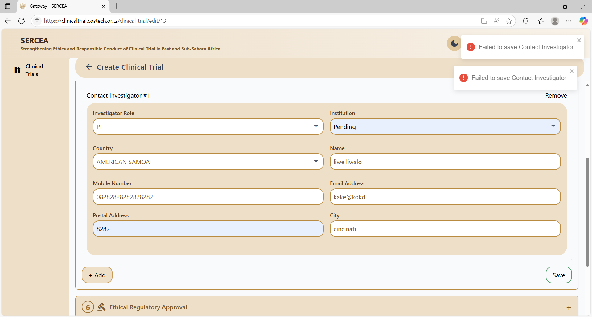
Contact Investigator
Concerns:
- UX: Long drop downs e.g country list should be searchable.
- Validation: Country - City dependency.
- UX: Meaning full field level validations not a general error: "Failed to add contact investigator"
- Button visibility as per proper state, e.g save should appear when the form seems valid.
- failed to save the form.
- UX: Make use of inline editing and input on a table rather than a form for such related multiple entity data. It's more neater and effortless for the user.
Ethical Regulatory Approval
Concerns:
- The concerned Ethical Review Board should get a notification and a link to this record. this could be for awareness or validation or courtesy.
- Validation : Save button continues to save when pressed subsequent times even without an attachment.
Funding Sponsorship
Concerns:
- Validation : Save button continues to save when pressed subsequent times.
- UX: Make Long dropdowns searchable.
Study Description
Concerns:
- Validation : Save button continues to save when pressed subsequent times.
Study Interventions and Outcome
Concerns:
- Validation : Save button continues to save when pressed subsequent times.